Harry's Nut Butter
--
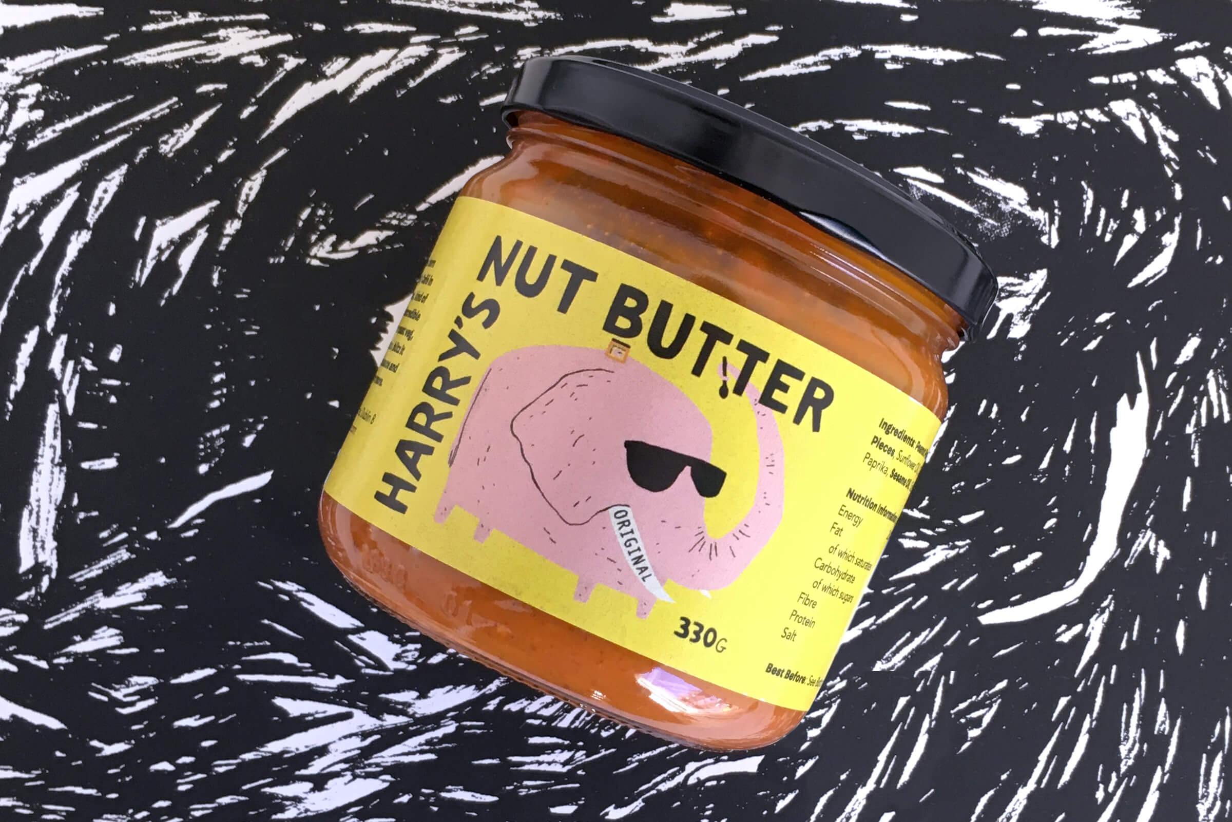
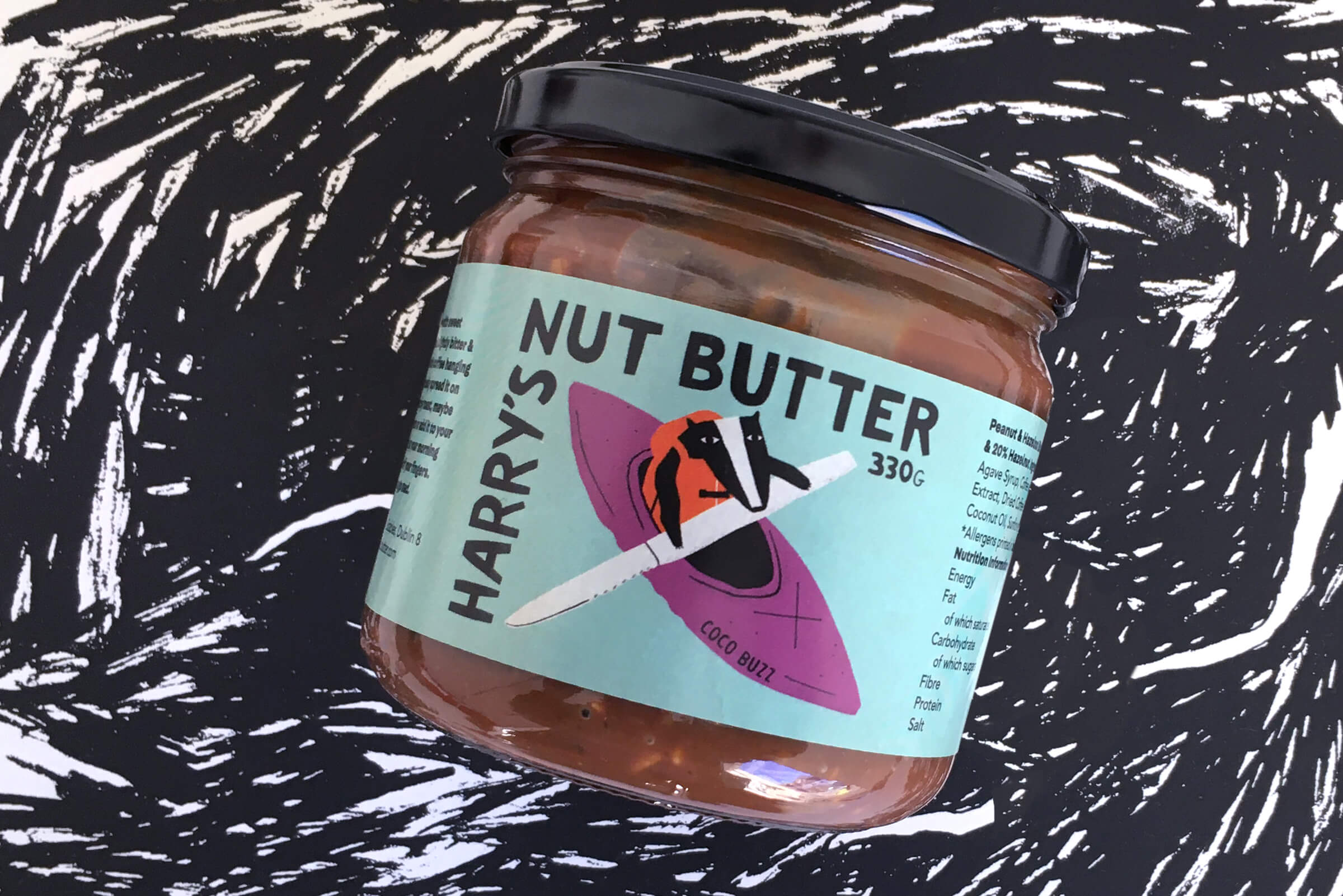
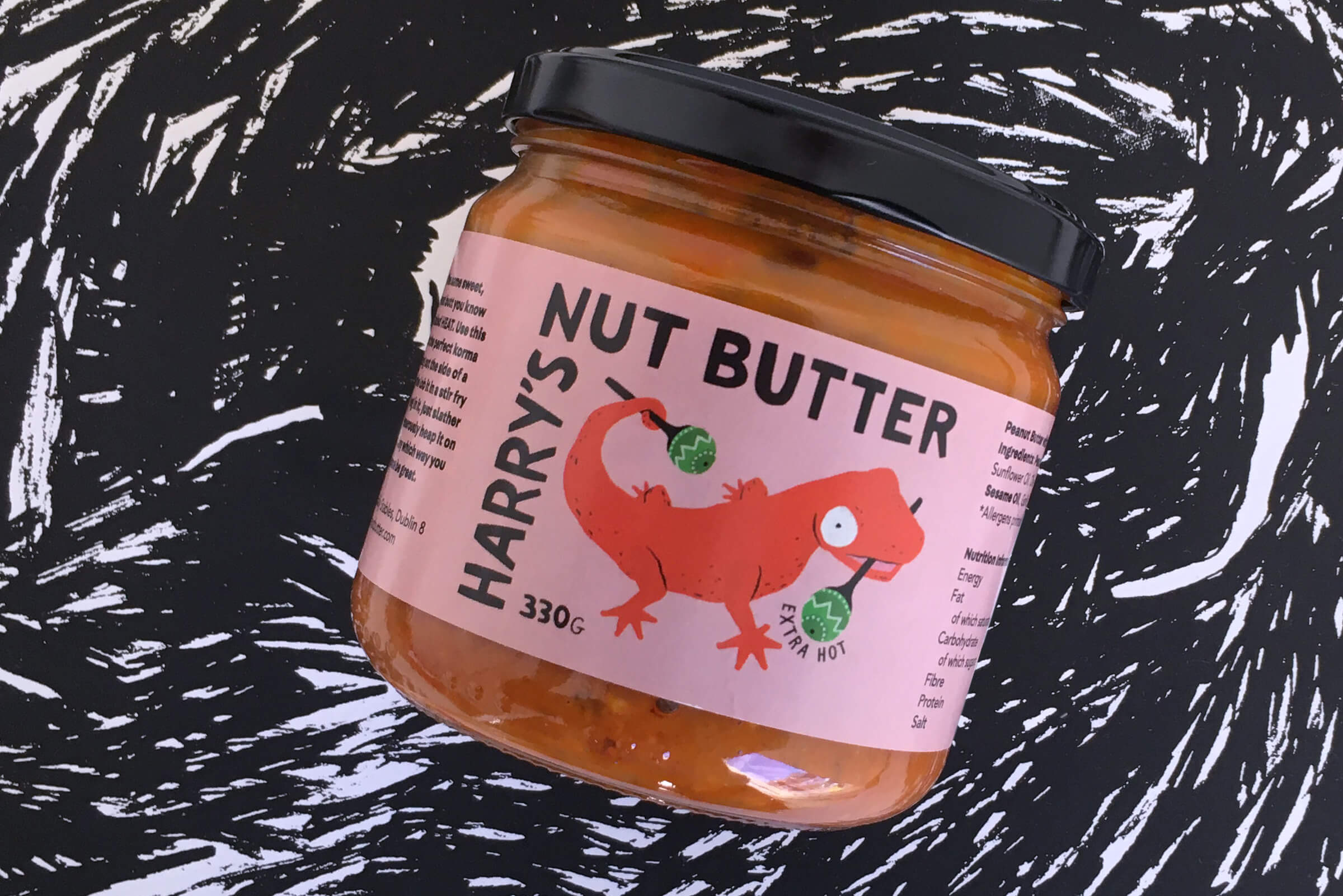
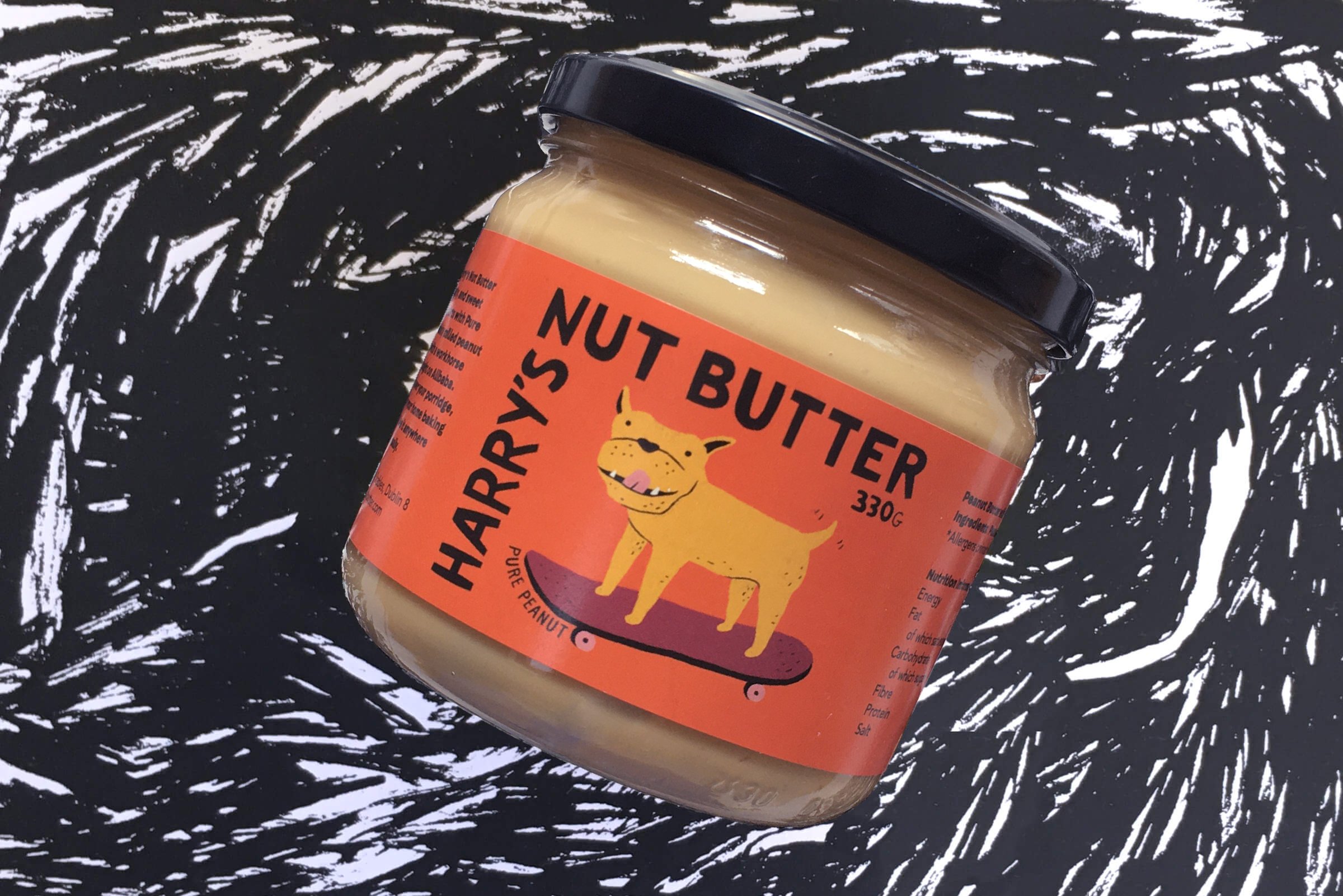
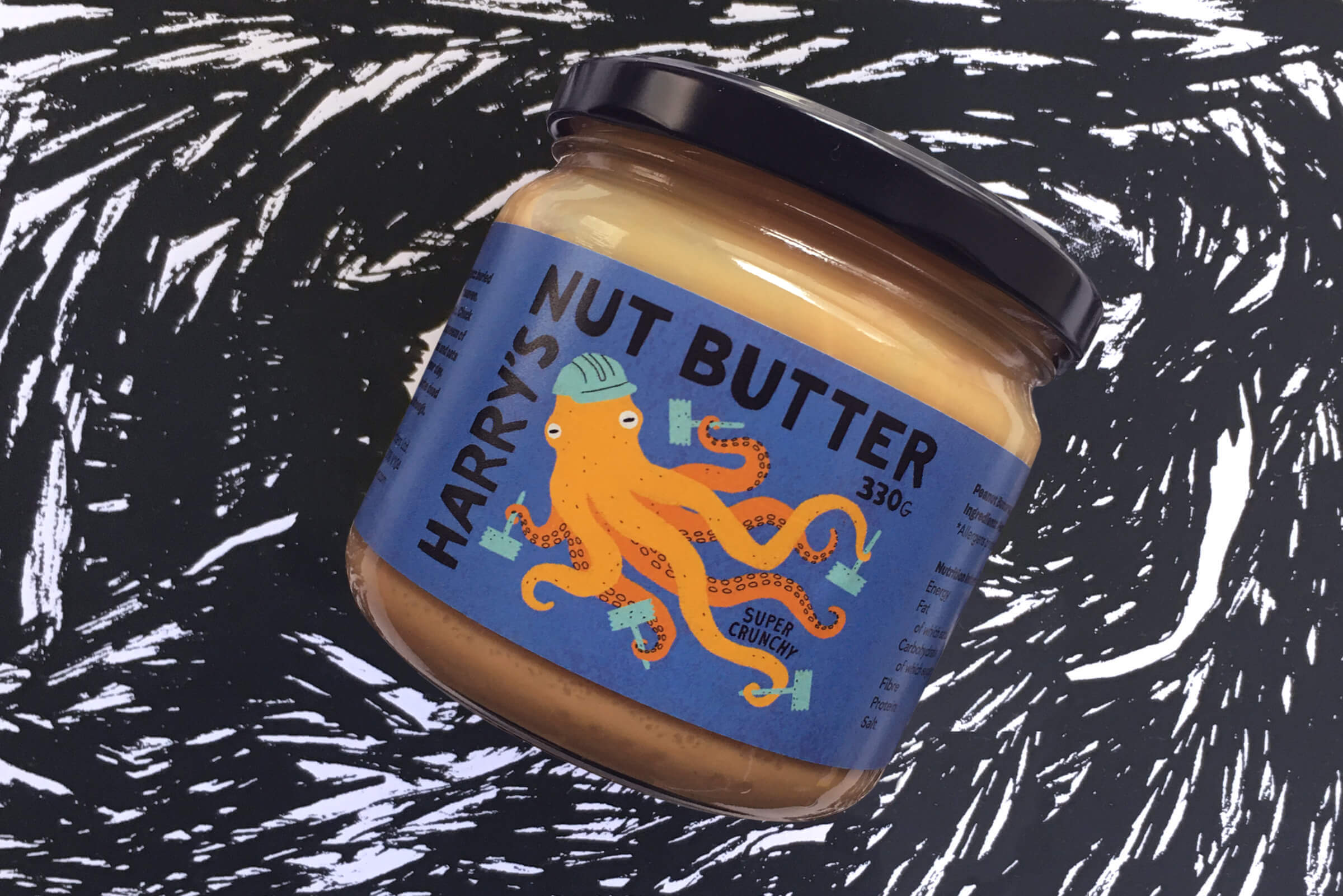
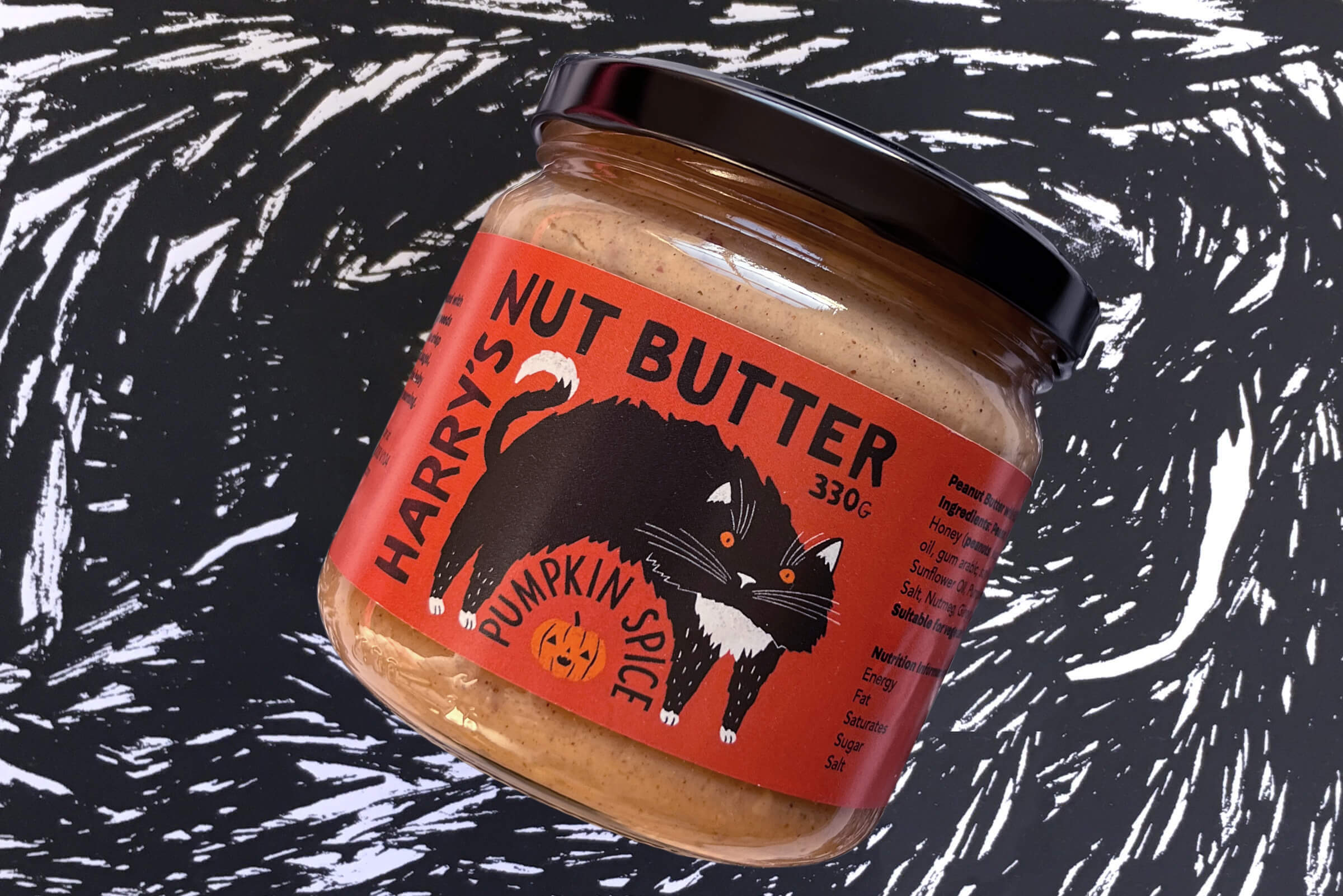
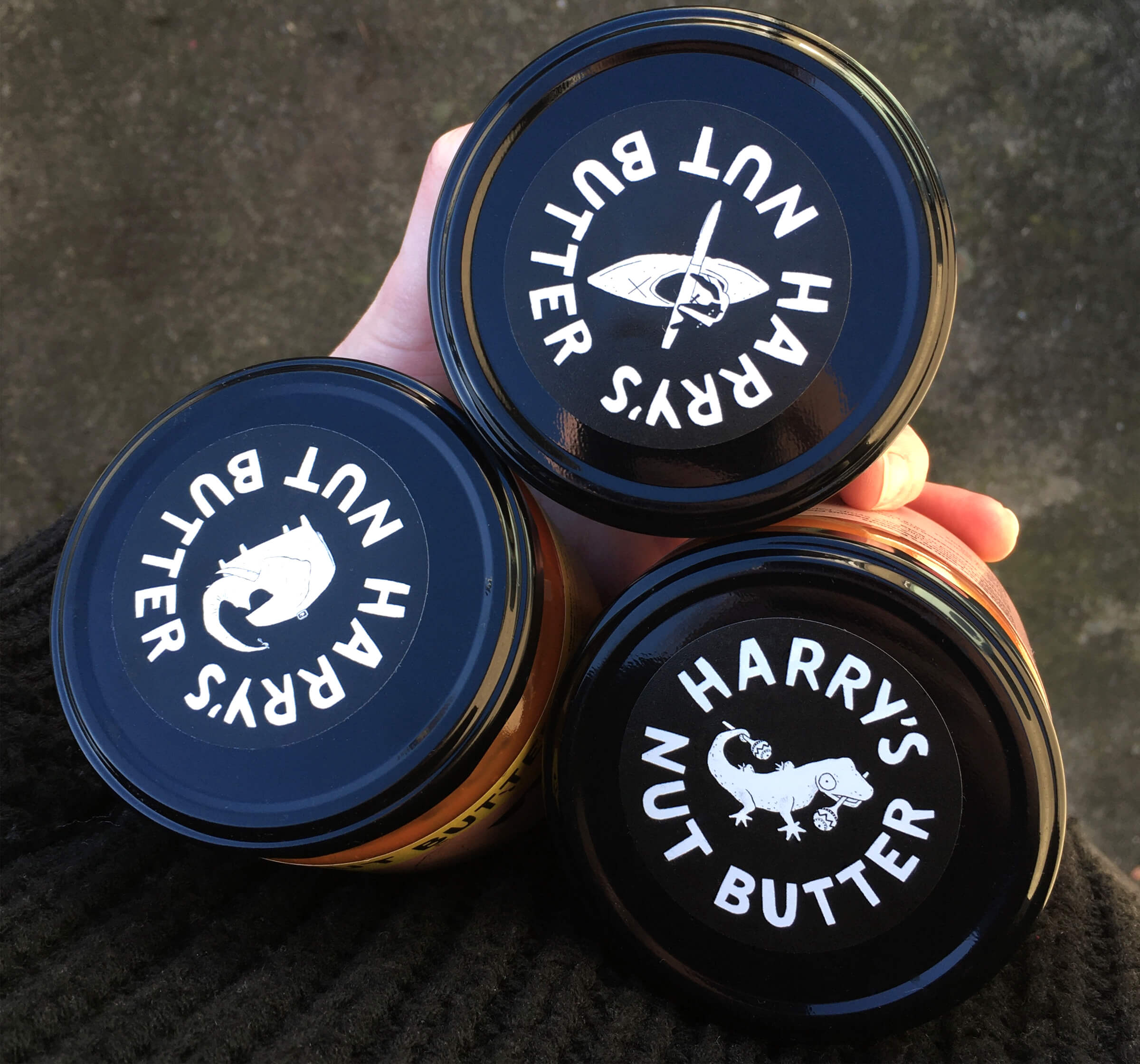
Harry approached me to design the identity & labels for Harry’s Nut Butter – a slightly sweet, kind of salty nut butter he had developed while working in the Fumbally Café in Dublin. It was clear that he wanted the design to be fun and playful, reflecting his personality. I created an illustrated character for each label that somehow represented the product. The colours used would help the product stand out on the shelf from competitors, while also bringing to mind the flavours. Chunky, hand-drawn type was used for the logo name to add to the playfulness of the identity. The lids of each flavour showed the different characters to make if easier for stockiest to organise and shelf the product. Follow Harry’s Nut Butter: @nutbutterharry